Thursday, 31 December 2020

Creating my new Panopticon series

Some projects are longer in the making than you expect. The Panopticon series certainly took some time in development.

I first visited Halo above Haslingden in March 2018 on a bitterly cold day. I'd planned to sketch - but it was way too cold for that, so I took lots of photos from all sorts of angles, exploring the structure for inspiration, preparing to submit a work to the Prospect Printmakers' Pennine-themed exhibition, which opened at the Whitaker Gallery in late April.

Halo


The original Halo edition was only five, however as the linocut was created from three plates, it gave me the opportunity to explore colour ways. I editioned the same plates in new colours for the Hot Bed Press 20:20 Print Exchange in 2018. 

A year later I visited the other panopticons - the Singing Ringing Tree, above Burnley, the Atom at Wycoller, and the final one, now closed, in Blackburn's Corporation Park.

Singing Ringing Tree


Atom


I designed the series to work together, on the same paper, with the same colour combinations, to exploit the drama of the landscapes and explore the potential of composition and tones in these linocuts. Two designs are multi-plate: Halo and Singing Ringing Tree, whilst Atom is a reduction.

Below are the images showing the lino plates themselves, stages of the work and the build-up of the layers.

3 of the 4 plates of the Singing Ringing Tree


Printing Singing Ringing Tree layer 1 


Printing Singing Ringing Tree layer 2

Singing Ringing Tree - building up the image


Stages of the Atom


2 layers of the Atom 

In reduction linocut the plate is destroyed


Printing the penultimate colour of Aton


The Atom emerges 

Printing the final reduction layer

The finished edition by Carolyn Murphy


To learn more about my work, please check out my website www.carolynmurphy.co.uk where you'll find my gallery, online shop and links to my social media.


Sunday, 11 October 2020

20:20 Print Exchange 2020

I love taking part in the 20:20 Print Exchange! It's that sense of community amongst printmakers in the UK and, increasingly, around the world. And the random nature of the selection you will receive - all sorts of techniques and images, some you love, some less so. And the exhibition goes on tour - for ages.

Of course, this year has been more challenging, so well done to Hot Bed Press for even managing to do the sort! I'm looking forward to receiving my box, in exchange for the edition of 25 'Towneley Hall' linocut prints I submitted. I decided on a new colour way of my 2-plate 'That Window' linocut - this time in copper and blue, specially for this year's print exchange. 

'Towneley Hall', my 20:20 linocut for 2020

Preparing the edition - colour 1

To learn more about my work, please check out my website www.carolynmurphy.co.uk where you'll find my gallery, online shop and links to my social media.

Wednesday, 30 September 2020

'That Window' at Towneley Hall

Printmakers from Alan Birch's Prospect Studio workshops were asked to create new work inspired by Towneley Hall in Burnley an exhibition called 'Impressions: A Printmaking Response to Towneley'.

The exhibition was due to open in April 2020, however the opening was delayed, like so many things in 2020, owing to the coronavirus pandemic.

The journey began for me in January 2020, when I visited Towneley Hall for the first time. It's set in stunning parklands and, even on a bitterly cold January day, the gardens were busy with local families out for a stroll. This window, in particular, caused much amusement with local children - and caught my interest as a result.

Towneley Hall in Burnley

The window - from inside


The window from outside at Towneley

Back at Prospect Studio, I worked up the image into a 2 plate linocut, which after a number of trials, I decided to print in gold and green.


This became my 'cheeky' submission to the 'Impressions' exhibition. 

'That Window' an original linocut by Carolyn Murphy

I visited the exhibition in September 2020 and loved the quality and quirkiness of the work from all the Prospect Printmakers who took part. I had the chance to view the exhibition in the next gallery, which included local watercolours by Turner. It was a fantastic day out, between phases of Covid-19 lockdown - and fantastic to see the exhibition and Hall so well supported by the whole community.

To learn more about my work, please check out my website www.carolynmurphy.co.uk where you'll find my gallery, online shop and links to my social media.

Saturday, 27 June 2020

Repeat printing

There seems to me to be something quite magical about repeat printing, whether on paper or on fabric. I first had a go many years ago on a course at Hot Bed Press, taught by Kiran Williams. We screen printed onto textiles and created a basic repeat design on calico, I believe, and created a tote bag from scratch. 

Since then I've come back to repeat printing on a number of occasions, exploring printing onto fabric, as well as the challenges of making the repeat plates themselves. Initially lino plates ended up strangely shaped, but worked well, before I then took the design back to a regular shaped plate. Here are some of my more and less successful efforts.

This tiny daisy design still one of my favourites. Here it's printed onto cartridge paper - the image is made up of 4 impressions.

Daisies on paper

Daisies on cotton fabric

Daisies in the hand-made signage I used at the North Wales Print Fair


Geometric tile formats work really well in my experience - and looked good on a fabric sampler.


The best solution I found for the 'ink' was actually acrylic paint and textile medium applied with a sponge roller. 

Who would be mad enough to try hand-printed Christmas wrapping paper? My top tip is start in July! Here's the plate design during the cutting process.


Starting the process

About two-thirds there!

The finished plate

I tested the design part way through with a proof, before continuing the final cutting. Here you can see the proof in red and the final design, printed in blue and silver water-based ink on a brown kraft paper roll. I'm pleased to say I did use it to wrap presents at Christmas!


I've also experimented with alternative approaches using 'A Field Guide to Fabric Design' by Kimberly Kight as my guide. Two of my favourites are below. The first one, based on an apple and apple leaf design has windy swirls from the lino. I printed this one onto old wallpaper and used it to cover a little notebook. 


Printed onto wallpaper

The final design I've included here has flower motifs, including the poppy. You can see the plate as well as the inking up process. I printed this design onto paper with oil-based ink.


In each instance I created the repeat pattern manually using tracing paper, pencil, scissors / craft knife and sellotape. It's immensely satisfying when it works and you can't see the join! Kimberly's book includes digital approaches, which I'm yet to experiment with.

To learn more about my work, please check out my website www.carolynmurphy.co.uk where you'll find my gallery, online shop and links to my social media.

Saturday, 20 June 2020

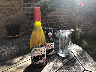
Labels for home-made ginger beer?

Have you ever thought of using linocut to create product labels? It had been on my mind for a while. I had home-made ginger beer in the fridge, in plain wine bottles, so I decided to have a go!

All just for fun, using 1 plate - and 2 ink colours, I decided on the name 'Murphy's Ginger Boom' - and here are my labels. 

Printed labels drying in the studio


Trimmed labels ready to go!

Yes, the fresh, live, natural, fermented product lived up to its name - and the label claims - and proved fairly explosive on occasions over the summer. Delicious and refreshing too. If you haven't tried it, I'd whole-heartedly recommend making your own old-fashioned fermented ginger beer - and the labels! 

On the bottles

Safest to open outdoors... delicious

To learn more about my work, please check out my website www.carolynmurphy.co.uk where you'll find my gallery, online shop and links to my social media.

Saturday, 23 May 2020

Experiments with embossing

I've been planning to experiment with embossing ever since I got my Hawthorn printing press - but have not had the time. At last, Covid-19 brought lots of other activities to a stop and I decided to have a play.

I chose a very simple and small design, so that I could learn faster. The first design is based on the ivy climbing up the wall in our back yard. I've included here pictures of the ivy, the plate and the emboss itself. I kept the cutting bold and the contrasts strong. You can see the results here - just about!

My starting point


I used damp etching paper to create the emboss. After the ivy design, which I felt had been fairly successful, I tried an oak leaf, following a similar approach.


I then had a go at experimenting with adding colour - using oil based-in diluted with white spirit to reach a watercolour consistency, painted onto the plate with a fine brush. The colour transferred onto the damp paper, initially lightly, then more strongly as I built up the colour.


I particularly liked the more subtle examples and the blind emboss (no ink at all). I'm planning to come back to explore this further as a 2 part process - adding the emboss to a dampened oil-based print.

To learn more about my work, please check out my website www.carolynmurphy.co.uk where you'll find my gallery, online shop and links to my social media.