Saturday 21 November 2015

Great fun experimenting with collagraph

Earlier this year I spent a whole weekend playing with collagraph at Prospect Studios in Rossendale - it was something I'd been looking forward to for a long time and was great fun! Previously I'd used mount board as a plate and cut into it - and had added materials like tape, carborundum, wallpaper or glue. This was the chance to check out all the other things I'd spotted or read about printmakers using, from bubble wrap to food. Some were more successful than others, it's fair to say. I'll be using a blow torch again with tile grout and packing tape, for example, but probably giving linguine a miss for collagraph prints.

The prints I produced are below. You can also see the plates - some wood, some mount board, some metal. I've listed the materials used in each plate - and outlined the ones I liked and didn't, for my own reference and maybe other printmakers will find it helpful too. Thanks to Alan Birch and Jill Randall for a fantastic weekend workshop.


 Here are the plates, all shellac coated - with a mix of "ingredients" added:


Ply wood plate with lentils, carborundum, sticky back plastic (burnt with blow torch), glue

 
Mount board plate (cut into in places) plus bubble wrap, lentils, wallpaper, embroidery thread & cotton


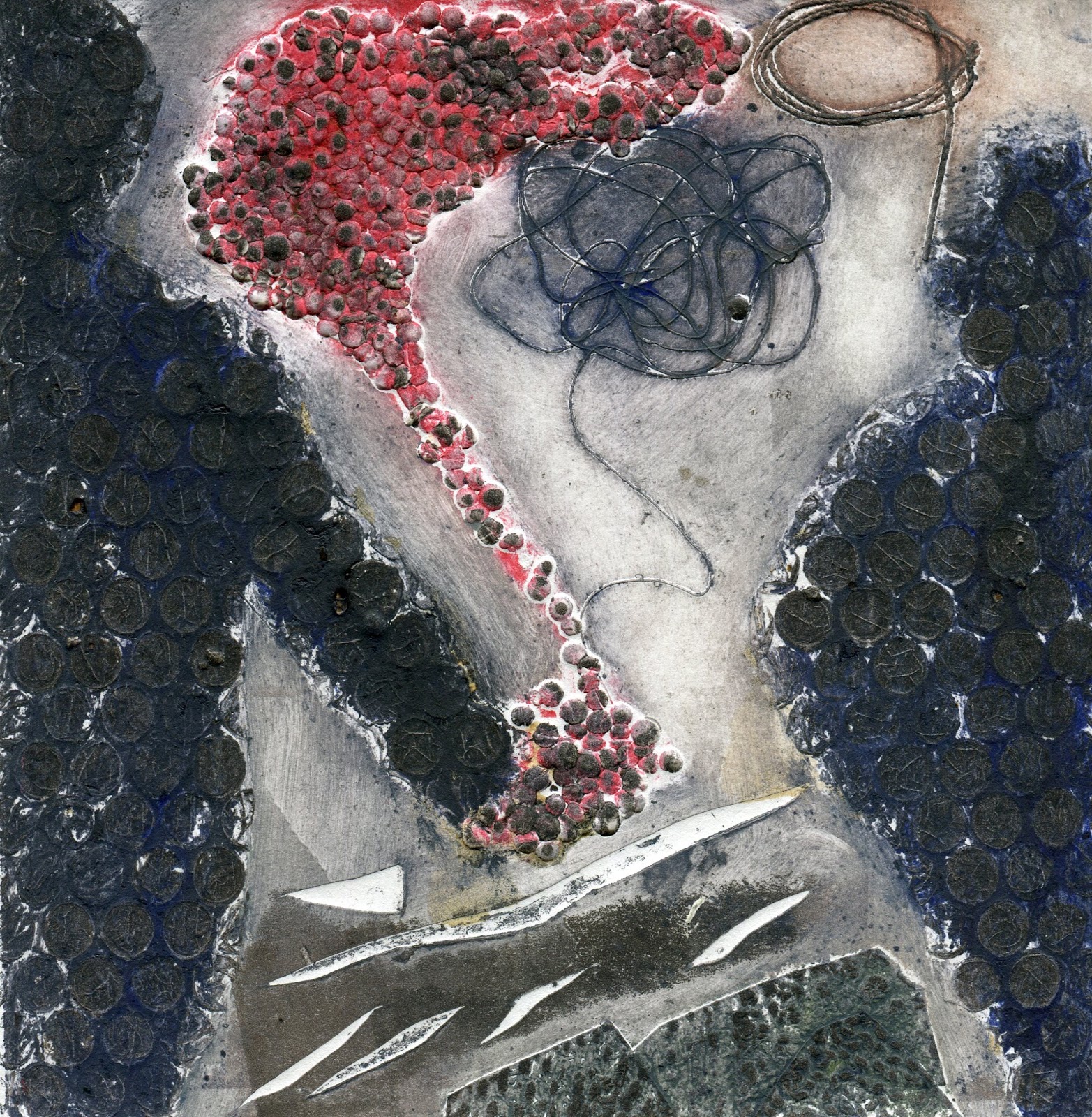
Metal plate with tile grout, scratched into, carborundum, wallpaper, lentils, porridge, beads & glue 

 
Mount board plate with embroidery thread, tile grout (scratched into), pieces of material, sugar, carborundum and glue 


Mount board plate with added linguine pasta, porridge, lentils, carborundum, packing tape, tile grout, wallpaper, glue  

 
Wooden plate with tile grout, carborundum and sticky tape, burnt and distressed, using a blow torch
 

My favourite materials were the tile grout and sticky tape, especially when burnt. They make fantastic textural patterns. The tile grout once bubbled with heat will break up a bit in the press. Tile grout scratched into and left to dry was excellent, along with carborundum and sugar.

I liked the bubble wrap but it's hard to control the effect. Glue when used thickly was excellent. For me (in moderation!) the lentils and porridge were great. They need to be shellac-ed well or they will try to come off the plate under pressure.  The threads worked well - particularly the thicker embroidery thread.

Linguine was far too brittle. The beads were far too thick and deep. It didn't work well to have too much variation in depth, for example cutting into the mount board as well as adding bubble wrap. I also tried rolling over a relief colour into the linguine rooftops. There was too much depth in the plate for this to work effectively. Another lesson learnt!

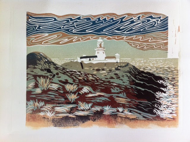
It's a great effect for a simple plate, as shown below, from a previous occasion:


Close up of collagraph print of the Isola Bella in Taormina, Sicily, with a blue relief "roll-over"
 

Shallow mount board plate, cut into, with added sandpaper and glue


The same plate printed in mono.

Saturday 31 October 2015

That 20:20 time of year!


After having had to take some time off from printmaking, I'm back and have just completed my 2015 edition for the 20:20 print exchange. This year I submitted prints with Prospect Studios, as I've done most of my recent work there. It's a hand-printed multi-plate woodcut, called 'The Low Road' based on a Scottish landscape:

I've chosen to adapt a 3 plate woodcut initially developed in Lucy Schofield's fantastic Japanese woodblock printmaking course, which I really enjoyed in September at Hot Bed Press in Salford. It was cut in the traditional Japanese fashion with a knife, called a 'hangito'. I've added some development phases below so that the transformation from the Japanese style is obvious.

My unfinished 3 block Moku hanga Japanese woodblock print was painstakingly cut in the correct fashion with the hangito knife held like a dagger to create a 'living line' (image size 14 x 10mm). The image was cut into 4mm Japanese ply, with kento registration marks, and inked up using water-based ink onto Japanese paper. It looked pretty good (though unfinished) at the end of the course on ozuwashi paper:


Course info on the link, in case you're interested:
http://www.hotbedpress.org/courses/japanese-water-based-woodblock-printing-mokuhanga/

I liked the image but wanted to add overlap colours (not a Japanese thing to do) to add interest. I also decided to add gradations and worked up a prototype to see what I could achieve with the same 3 woodblock plates. Once I was happy with the prototype (first image below) I finished cutting the final plate, removed kento marks and built up my 20:20 edition colour by colour. This is how the image built up - colours 1, 2, 3 and a border:

Below you can see the key plate, entirely cut with a knife and surrounded here by a mask to keep the 20:20 image clean. And finally all the 20:20 original woodcut prints, hand-printed at home, drying in my dining room 'studio'!
 

Wednesday 25 March 2015

Strumble Head Lighthouse variations

Day 3 of the Ian's workshop and the 4 colour reduction linocut of Strumble Head lighthouse in Pembrokeshire suddenly came together. Because we used graduations of 2 colours on 3 of the 4 layers, there look to be more colours in the prints than you might expect. The colours were mixed by Ian and standard to all 3 of the workshop participants, so that we focused more on tone than colour - a useful exercise. As some of the graduations were reversed, there are variations in the series of 4 prints. They each have lessons for the next time, but I'm pleased with the results. Let me know if you have a preference!


Linocut of Portnahaven on Islay

Day 1 of Ian Phillips' workshop in Machynlleth, we worked on a black and white lino cut. I chose to work up an image of Islay that I sketched last year during the Islay Whisky Festival, looking over the small cove at Portnahaven. I've included below the print, the plate, the simplified sketch used to translate it to lino, the original sketch - and finally a reference photo of the same spot. They reflect the many adjustments and choices in developing a lino print...


Monday 23 March 2015

Linocutting in Wales

Spent a great day today cutting an A4 mono lino design on a linocut printmaking workshop in Machynlleth, in Wales, with Ian Phillips. He does some amazing  large scale work - A2 upwards - and is clearly influenced by his experience of printing with Torres Strait Islander printmakers in Australia. Looking forward to day 2!

Sunday 8 March 2015

Kevin Holdaway's talk and demo at Hot Bed Press

On Friday night I went along to Hot Bed Press in Salford for Kevin Holdaway's talk and demo, which I found fascinating. It was great to see his enthusiasm and passion for linocuts shared with such a big crowd.


Kevin has an exhibition on at the moment at Stockport Art Gallery, which I got along to today: http://stockportartgalleryproject.com/kevin-holdaway/ including some great images of Manchester and Stockport:


Some prints have 33 colours - mind boggling! I really enjoyed the talk and picked up some great tips. Particularly interesting to see the condition of the lino plates at the end of the reduction process, the templates and the record of printing dates and colours.


Thanks for a really interesting evening - and a great insight into techniques developed over 30 years. Loved it! My personal favourite remains the original inspiration in Florence:


Saturday 21 February 2015

Spectrum Exhibition in Didsbury

It's now the final weekend of our exhibition in Didsbury's Old Parsonage. It's been a great success with lots of visitors at our Opening on Sat 7 Feb and since  - and sales too. Malcolm Allum and I were in the yellow gallery and Anne Mackinnon and Janet Higgins had their work in the red gallery. The prosecco and mini cupcakes went down well - inspired, Malcolm!  Friends and family, as well as regulars to The Old Parsonage, all came together - with a great atmosphere. Thanks to Roddy McColl and Phil Portus for images below:


Thursday 5 February 2015

Didsbury Exhibition - work on the walls!

Today we have been hanging work for the Spectrum exhibition in Didsbury's old Parsonage. It's an amazing venue - in great gardens. It's starting to look good! Almost ready for Saturday's opening and preview 2 - 4pm. Malcolm Allum and I got our work up today. Anne Mackinnon and Janet Higgins are putting up their work tomorrow. Here's how my work is looking so far. I do hope you can come along!


Sunday 1 February 2015

The Old Parsonage Didsbury - Spectrum Exhibition

I'm now at the final preparations stage for our Spectrum exhibition at The Old Parsonage in Didsbury, Manchester. There will be a mix of older and new work. I've been finishing off some new prints this week at Hot Bed Press, to make sure they will be in the show, including a new 3 colour lino print of Manchester bees and a large scale lively and chaotic screen print:


I'll also be including "Scottish Sheep" exhibited previously at Stockport Art Gallery and An Talla Solais in Ullapool.


We are expecting a good turnout at the Preview on Saturday afternoon (7 Feb) 2 - 4 pm, so really looking forward to Spectrum, the first exhibition I've been involved in for a while.

Saturday 10 January 2015

Some of my etchings


I'm trying to decide what to include in the Spectrum exhibition - and may include some etchings. The only one that has been exhibited so far is Bridgewater Canal, which was selected for the Stockport Open Contemporary Exhibition. Choices include (in order) I Love Manchester 2012, Cwm-yr-Yglwys, Strumble Head Lighthouse, Bridgewater Canal and On the Verge:


Feedback is very welcome!